Informational Wall design
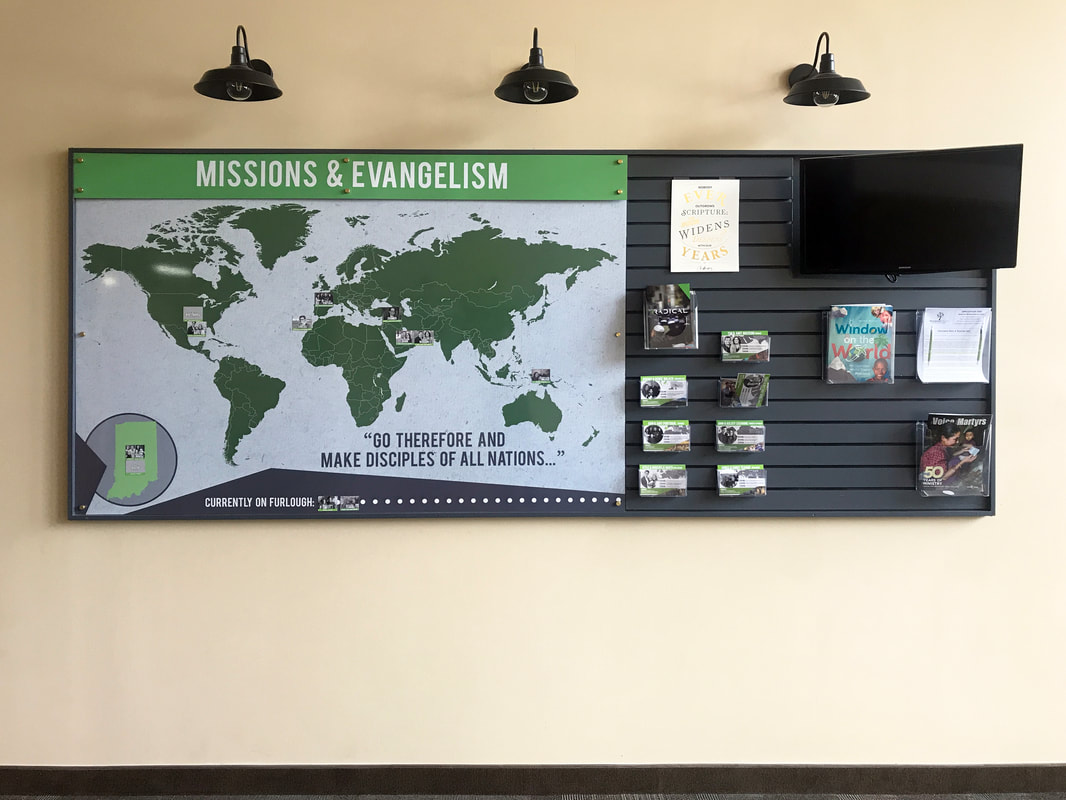
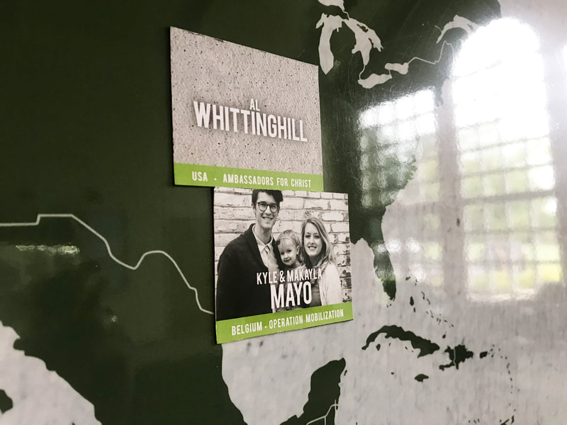
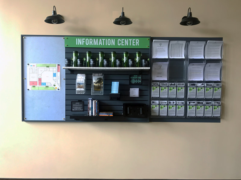
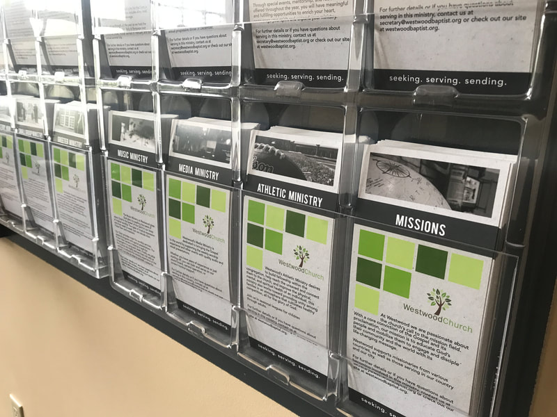
I was tasked to create an informative wall display that would be installed inside the foyer of Westwood Church. The client needed to display information clearly and be easily able to change and update as necessary. The display would also need to match their already established branding. In the end, the client was given two separate wall displays that utilized magnetic, graphic-wrapped metal with built-in slat walls for both design uniformity and functionality. I also designed magnets and rack cards for this display.
Print Design - Tri Fold Brochure
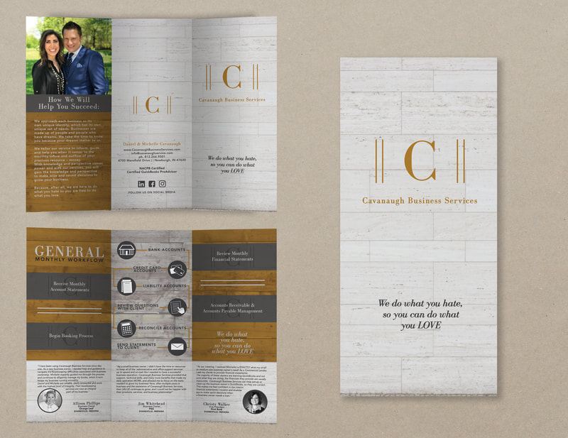
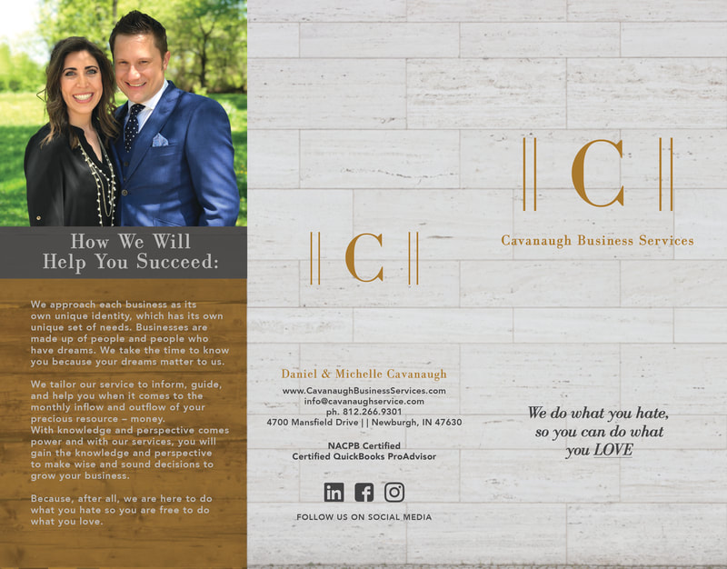
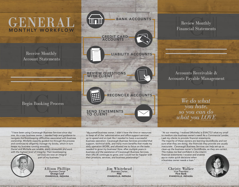
Cavanaugh Business Services requested me to create a tri fold brochure design that could easily walk their new clients through their book-keeping process. They also wanted to share more about the personal side of their business and client testimonials.
Print Design - Die Cut Brochure
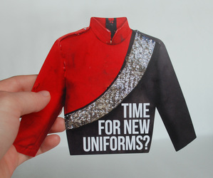
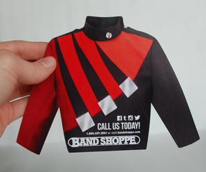
Created for Band Shoppe, this die-cut brochure was designed to give to directors or boosters to evaluate how they want their band to be perceived. The company needed a print item that would stand out from others at trade shows and events. I worked to create a piece that not only stood out based on the content, but the shape was also completely unique.
Catalog Design/Layout - Band Shoppe 2021
Catalog Design/Layout - Superior Cheer 2020
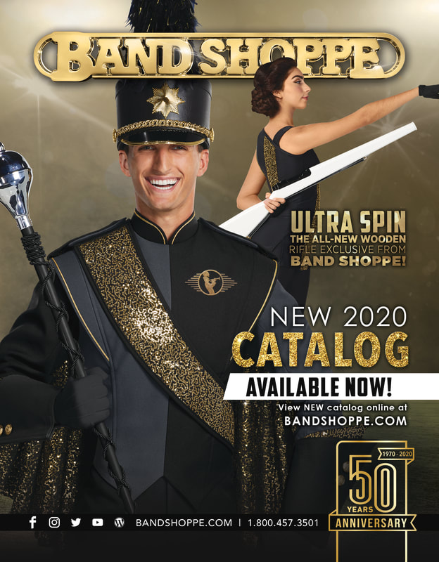
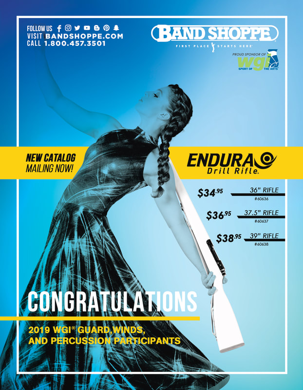
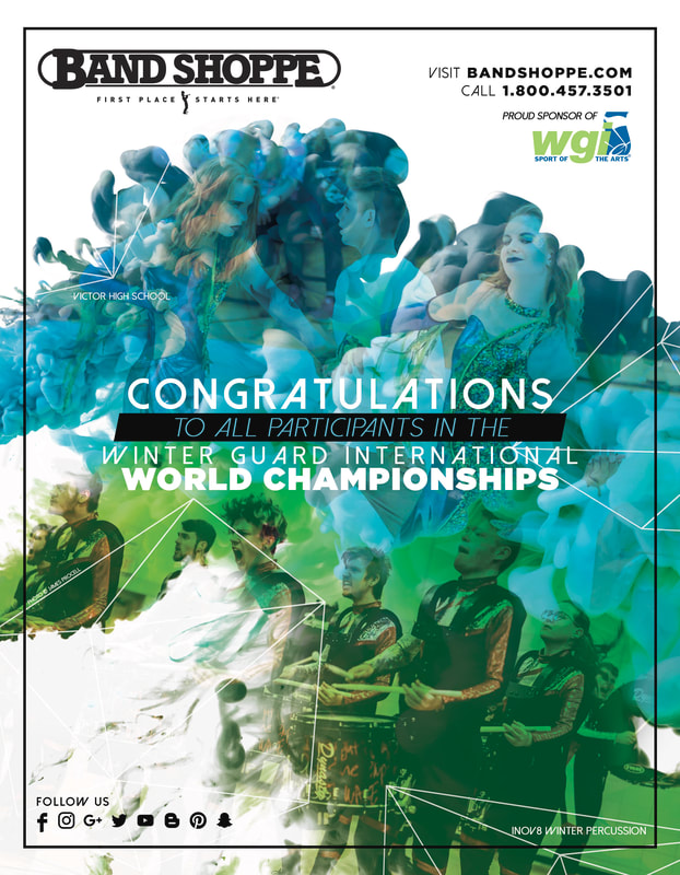
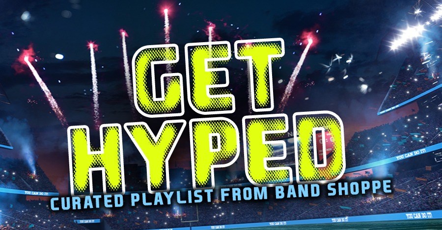
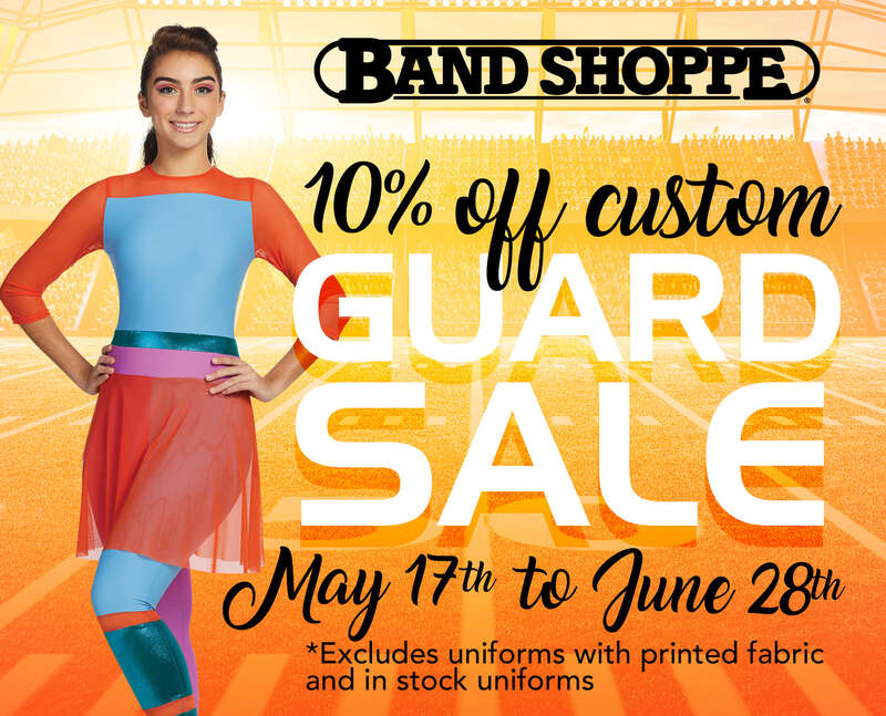
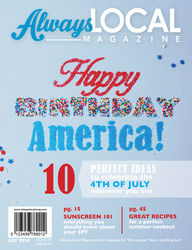
Print Ad Design - Band Shoppe
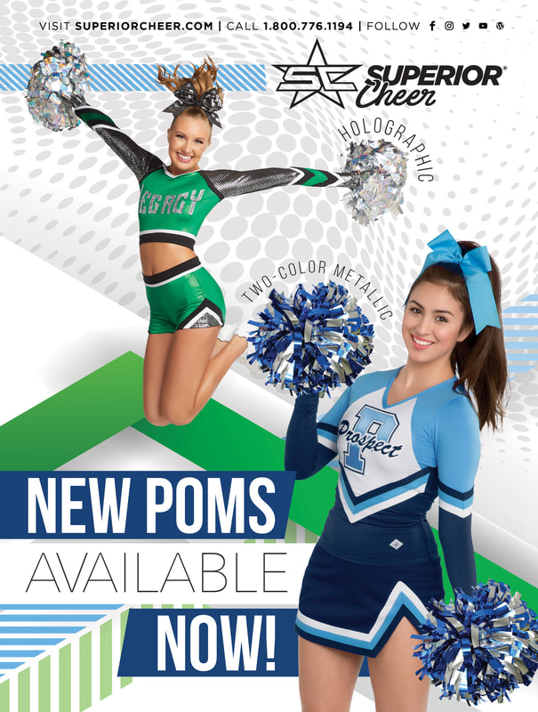
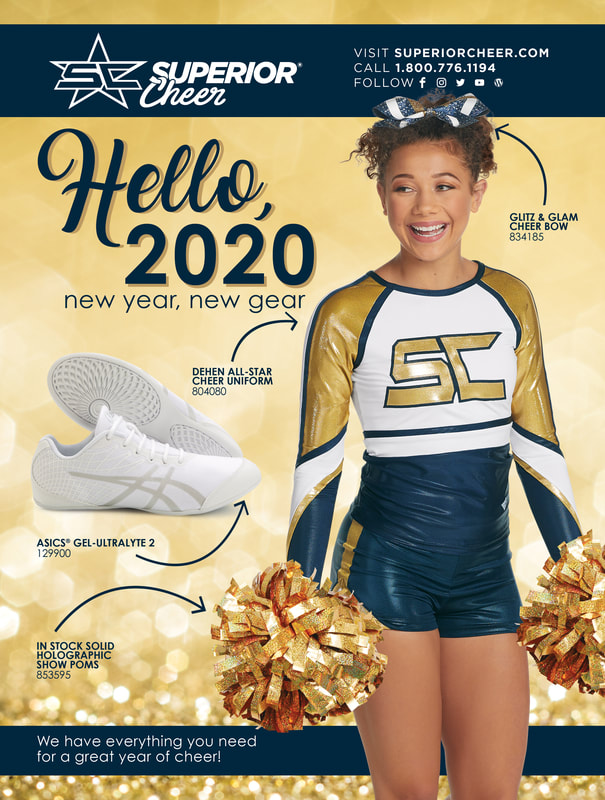
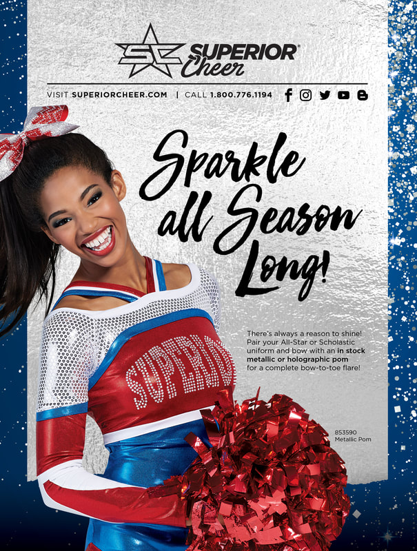
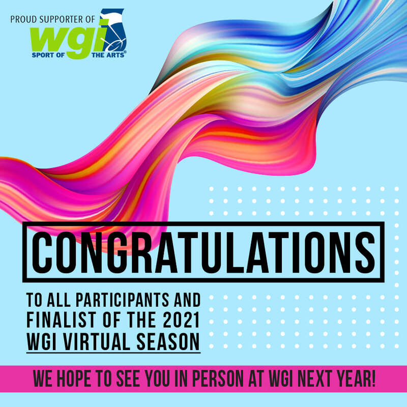
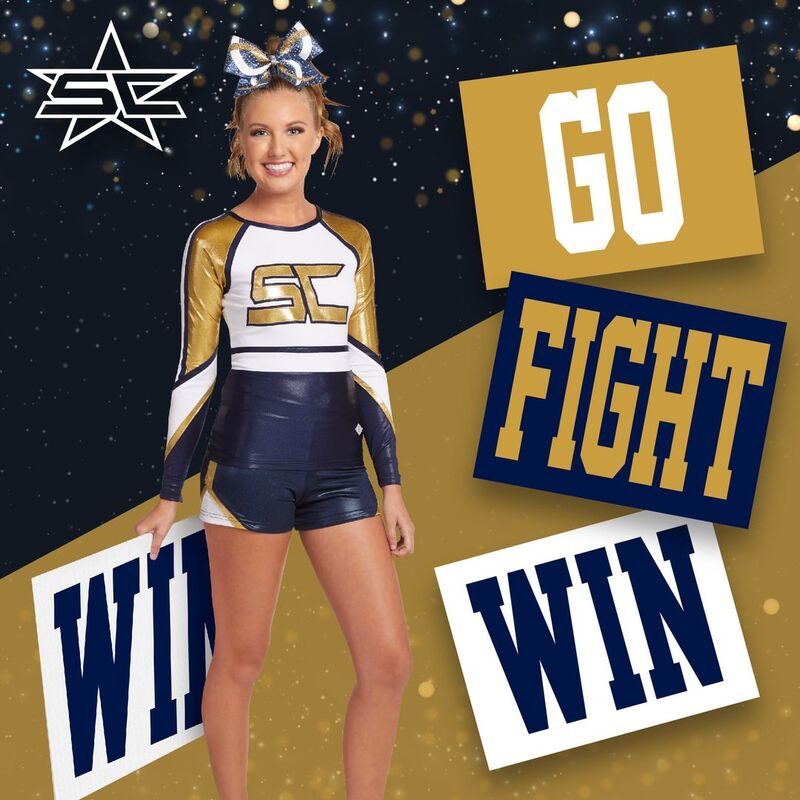
Print Ad Design - Superior Cheer
Print Ad Design - Superior Team
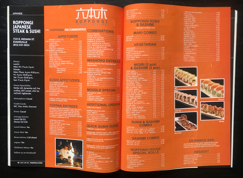
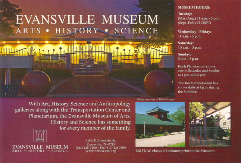
Print Ad Design - Evansville Living Magazine
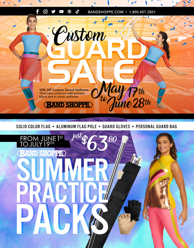
Digital GRAPHICS - Band Shoppe
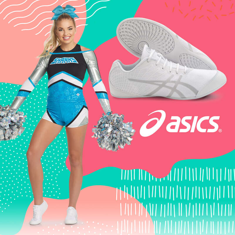
DIGITAL GRAPHICS - Superior Cheer
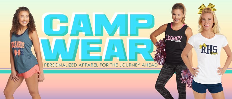
Email Design - Superior Cheer & Band Shoppe
Additional Email Designs
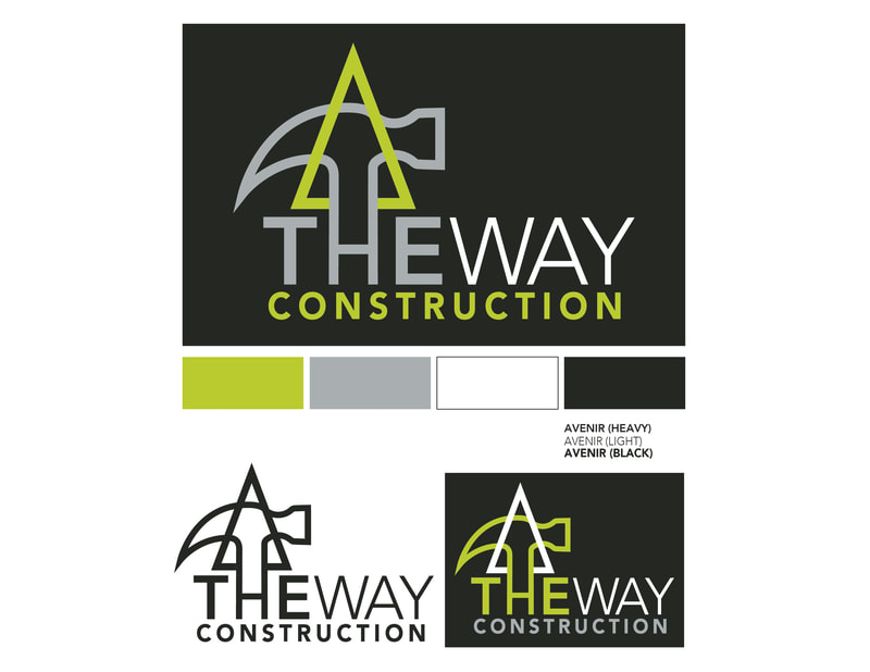
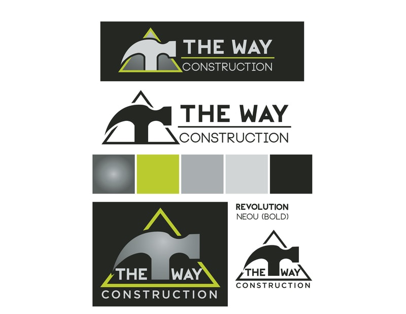
Branding - The Way Construction
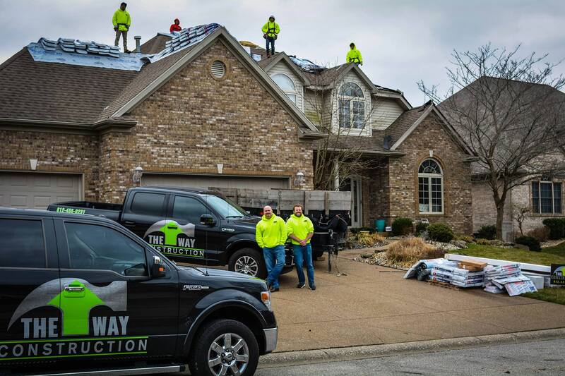
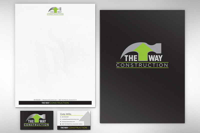
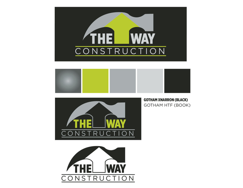
Cody Willis, the owner of The Way Construction entrusted me to create branding for his new roofing and construction business. After discussing the design details he wanted to see in his branding mark, I provided several design options for him to evaluate. Once his design was selected and updated as necessary, Cody wrapped his construction vehicles and The Way Construction logo was seen all over town. I also created business cards and stationery for The Way Construction.
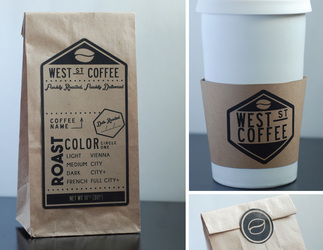
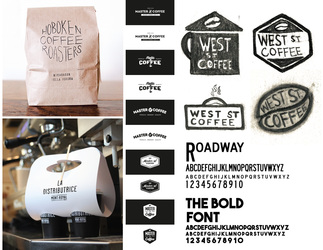
Branding - West St. Coffee
This branding project was created for West St. Coffee, a mail-order only coffee roasting company. The simplistic business plan laid a good foundation for the simple logo design, which drew inspiration from street signs and postal stamps. The bag was designed to be multi-functional so that the business owner has the freedom to mark the bags according to what has been purchased as needed, meaning less waste and more profit.
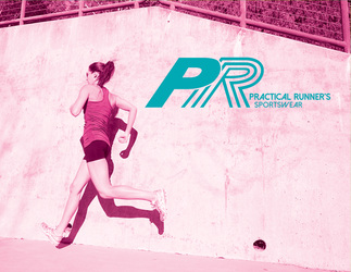
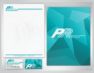
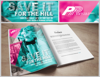
Branding - Practical Runner's Sportswear
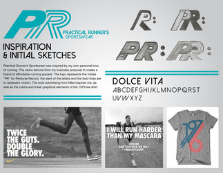
Branding proposal for Practical Runner's Sportswear. A company that sells affordable running apparel. This branding project included a logo, brand identity, advertisement and a graphic tee shirt design. This brand of apparel would be sold wherever running merchandise is sold. My goal for this project was to create a modern brand that would appeal to everyday runners and athletes.
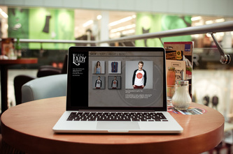
Branding - Grey Lady Skateboards
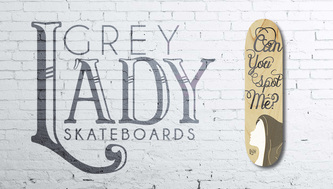
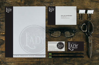
Grey Lady Skateboards is named after the Grey Lady Ghost myth of Willard Library. This brand brings steam punk artistic styles to each of the designs, incorporating the history of the myth’s origin.
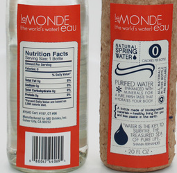
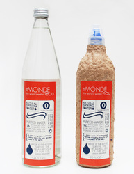
PACKAGING - Le Monde Eau
This company focuses on great quality water and Eco-friendly packaging, sold in upscale grocery stores. The labels showcase some info graphics and bright colors to make this water company stand out from the others on the shelf.
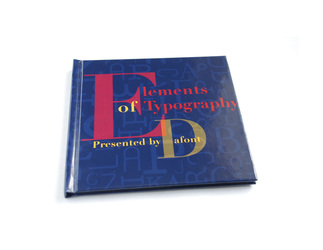
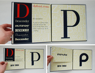
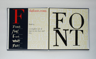
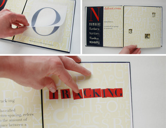
Book Design - DAFONT Font Catalog
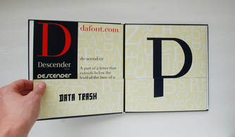
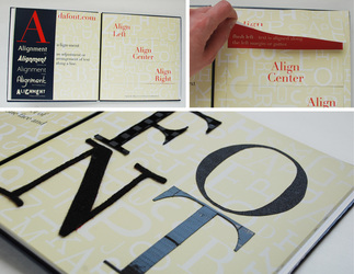
This is a font catalog I created for the website Dafont.com. I wanted to think outside the box with this design, so I created the book to be interactive. Each page illustrates an element of typography, while only using fonts from Dafont.com. The interactive elements range from trying out different Descenders with different fonts to physically moving space between letters to create Tracking. It encourages the reader to experience typography in a new way, actually physically interacting with the page.

